An exhibition showcases how, between 1918 and 1939, posters made in Poland had an identity of their own

This 1929 poster was made by Tadeusz Gronowski, one of Polands greatest poster-making icons in that era. It was meant as an advertisement for snow shoes for women, and is a perfect example of how modernist touches influenced many of the posters from that
The evolution of the art of poster-making in Poland has an intrinsic link with historical developments that have shaped the country. The movement began in the late 19th century, when Russia, Austria and Germany still held sway over different parts of the region. This was also when colour lithography gained prominence in France, popularising the mass production of printed posters. And the first wave of Polish artists kept their work rooted in folklore and traditional paintings, while also keeping a window of influence open for the modernist movement that was taking place in other parts of the continent.
ADVERTISEMENT

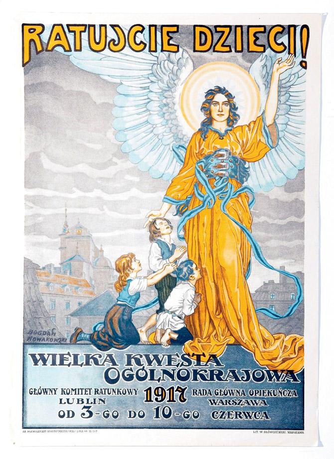
This 1917 poster by Bogdan Nowakowski borrows elements from folklore to spur donations for a charity drive for children.
Then, in 1918, the end of WWI meant that after about 120 years, Poland finally became a cohesive independent nation once again. This led to the artists of the era using the medium of posters to form a unique style that would be emblematic of a new-found national identity. It was also a period of heavy industrialisation and resultant consumerism, meaning that advertisers gave the artists an added avenue to express themselves using prevalent trends, such as cubism. Consequently, the art of poster-making reached new heights in Poland in this period.

BolesÅÂaw SuraÅÂÅÂo-Gajduczeni-s 1935 poster promotes a sailing event at a lake called Narocz. By then, modernism was firmly prevalent in Polish posters.
But the outbreak of WWII brought that movement down to its knees. When it ended, a socialist regime emerged that frowned upon the ideals of consumerism, and hence advertising. So, Polish posters were mere vehicles for political propaganda till the late 1950s, when a revival of sorts took place in the country, thanks mainly to the formation of the Polish School of Posters.

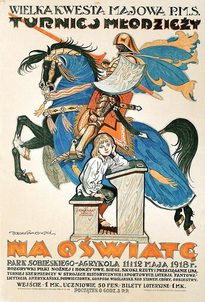
Bogdan Nowakowski-s 1918 poster promoting education is an example of how nationalist symbols, like that of an army man, were used to forge a national identity.
Now, an exhibition at Byculla-s Bhau Daji Lad Museum will shed light on the most noteworthy posters from Poland in the 1918-1939 period, when the craft was at its zenith. "We can say this because when the Paris Exposition of Decorative Art was held in 1925, a lot of Polish artists won great accolades there. This was possible since the poster-makers in the post-1918 period developed their own style to form a sense of national identity, fusing many native folk patterns with more modern elements," says Aneta Swiecica of the Polish Institute in New Delhi, who helped stage the exhibition in Mumbai. "But at the same time, there were also artists who were making posters for huge companies like Philips, Palmolive and Ford, and these were totally different in style. So the point is that in this period, there is no single identifiable norm in Polish posters," she adds.

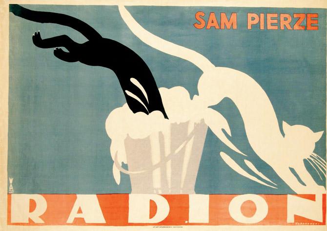
This poster is the most iconic one of the era, and is titled, "It washes itself". Tadeusz Gronowski made it as an advertisement for Radion, a washing powder. The black cat turning white makes the message clear, despite the style being minimalistic.
Swiecica has a point, proof of which lies in the diversity that-s on display in the posters accompanying this article. Check them out to get a sense of a unique period in art history, and head over to the exhibition for an even better grasp of the subject.
ON October 11 to 23, 10 am to 6 pm
AT Dr Bhau Daji Lad Museum, Rani Baug, Byculla East
CALL 23731234
Cost Rs 10 museum entry fee per adult
Catch up on all the latest Crime, National, International and Hatke news here. Also download the new mid-day Android and iOS apps to get latest updates
 Subscribe today by clicking the link and stay updated with the latest news!" Click here!


