A graphic design studio is documenting another side of Mumbai's art deco history through the letters of the English alphabet

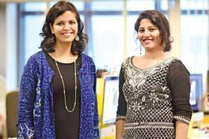
The team behind the initiative: (left) Ruchita Madhok and Mukta Pai
Among the most distinctive design movements in the past century was the Art Deco movement, whose origins can be traced to France just before WWI, in 1925. Short for Art Decoratifs, this movement, principally characterised by sleek lines and bold curves, went on to influence architecture, graphics, interior design, fashion and advertising till the mid- 20th century. In Mumbai, then Bombay, it was the 1930s, when the city embraced art deco architecture.
And, along with it came a distinct visual language in the form of letterings. While the buildings still stand tall, relentless rounds of reconstruction and renovation over decades have erased a large part of these typefaces. But, from what remains, a graphics design studio in the city, has set out to cull 26 letters of the English alphabet.
The Storycity team at Kahaani Designworks started their research on art deco buildings in the city around nine months ago, for the purpose of this project. Ruchita Madhok, principal designer, says, "The team that runs the website Art Deco Mumbai and us have been contemplating for long doing something together. We, being graphic designers, are naturally drawn to type. During our research, we saw that some buildings have retained art deco style lettering. In most of them, the nameplates have changed. And if they do have lettering, they don't align with art deco. Some bungalows in Shivaji Park and Matunga have Marathi signage now." For over two months Madhok, Mukta Pai, designer and Tanushka Karad, a design intern, scourged the city to find typefaces they could work with.

Tanushka Karad
"There were no fonts back in the day. It was the architect who designed the nameplate as well. They are all geometric, not cursive, a combination of lines, triangles, semi-circles, rectangles and squares, resembling the style of the building. Art deco came about at the time of industrialisation, so the language is the language of machines, and the shapes are those you can achieve with machines — geometric shapes," Madhok says. The graceful and symmetrical arrangement of letters, reveal how they were welded or punched in.

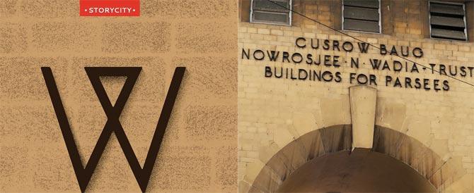
The 'W' was culled out from Colaba’s Cusrow Baug
"If you look closely at the letterings on the buildings you notice these details. For instance, Elysium Building near Colaba Market has the name etched into glass. It's beautiful. In the 'C' of Palm Court near Oval Maidan, a closer look reveals a shape within it, while from far, it looks like a dark brown letter. Sometimes, from one circle, all the letters in the name are cut out. These letters show us how the graphics were made, translated from paper, into a physical form. Nowadays, all signage is digital, and, therefore, flat," says Pai, a Chembur resident who has been on the trail of art deco signage in the area.

While the 'C' has been taken from Palm Court in Oval Maidan
Often, while taking in the finer details of buildings, they draw suspicious stares from passersby. "You're almost always questioned by the building's watchman while taking a photo. Then we just say something like, 'aapka building itna sundar hai'," laughs Madhok. She continues, "But, in a lot of cases, most residents, especially in the suburbs of Khar and Santacruz, aren't aware of the architectural heritage of their homes. In that respect, Dadar has done well. A lot of Parsi residents have retained not just the original nameplates but also the grills and window styles. How something is preserved entirely depends on the ownership."

The 'F' has been extracted from Oval Maidan's Fairlawn building
The project started off on Instagram with the letter 'A' culled out from Fort's Rutton Manor. Colaba's Brightlands gave them the swanky high-waisted 'B' while 'C' came from Oval Maidan's Palm Court. An 'M' is likely to come from Charles Manor in Bandra, while Vilhervin, in the same area, has lent the 'R'. On occasions they have used the same buildings twice. While they have identified references for almost all letters, the team is still looking for an 'X'. "Two-dimensional images of these letters are very different from what you see on the spot. These letterings are almost always off-set from the building. So, the way the sunlight falls on them defines how they appear," says Madhok.
 Subscribe today by clicking the link and stay updated with the latest news!" Click here!


