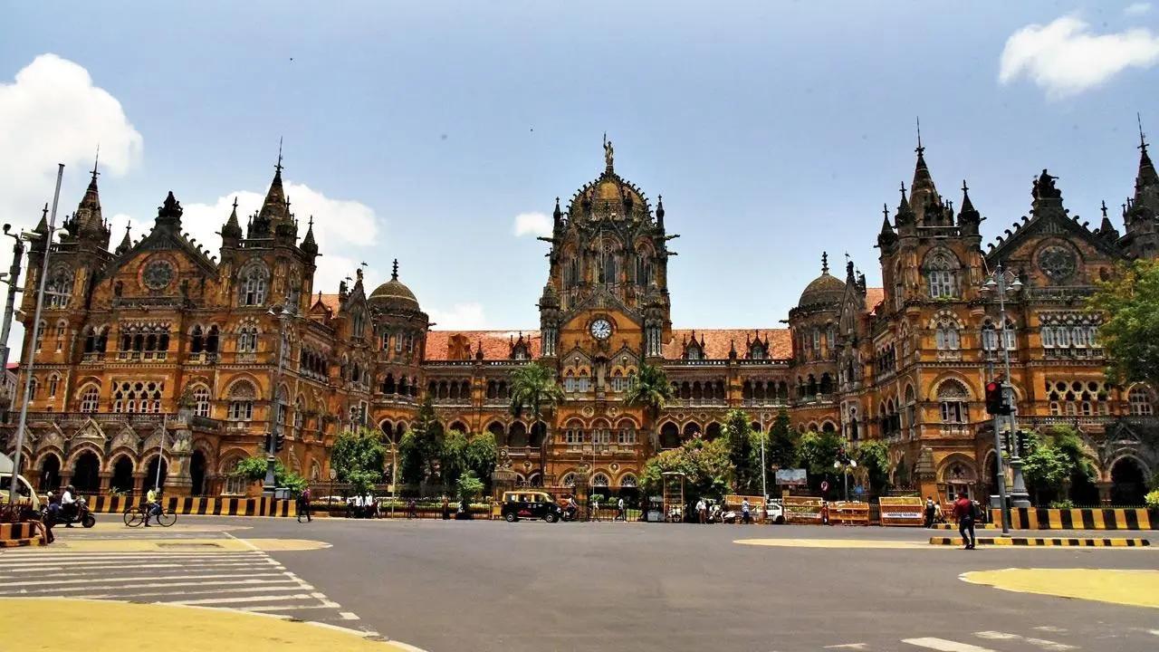
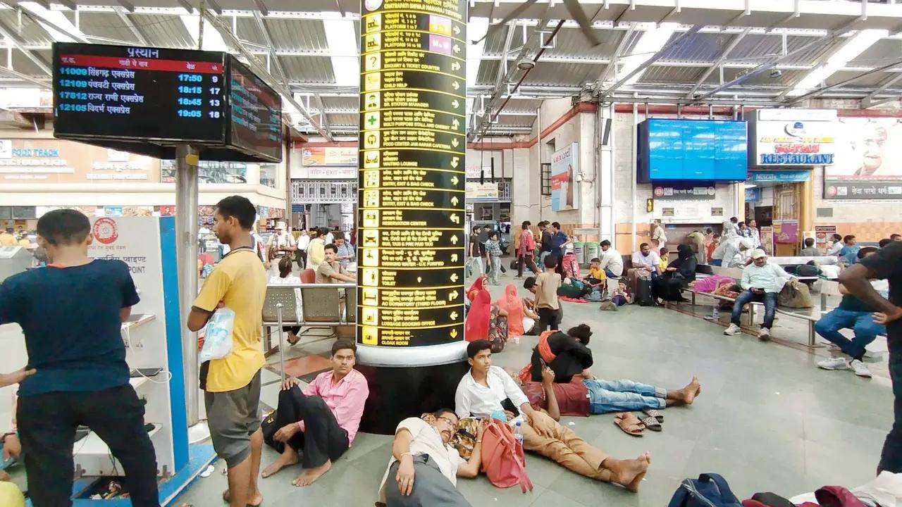
The signage at Chhatrapati Shivaji Maharaj Terminus (CSMT) has been described as ideal and other stations across Indian Railways have been recommended to emulate it in the latest national railway signage policy document, which has been updated for the first time since 1999 Reports Rajendra Aklekar see pics/File Photos
Updated On: 2023-06-10 12:25 PM IST
Compiled by : Anagha Sawant


The national railway signage policy document mandates that the English text font for signage should be Helvetica Bold for all non-illuminated signs and illuminated signs while the Utsaah Bold font should be used for all Hindi text. For regional languages, the fonts must be suitably selected with the approval of the local divisional railway manager concerned
“Signage at various parts of CSMT station, including the concourse, entry/exit gates, circulating area, direction boards, individual platform signage, have been cited as ideal examples,” said the railway official, stating the document also praised the way the signs have been placed, their design, elliptical glow boards, size of text graphics and uniform LED illumination
According to the document, the objective is to provide a uniform rationale for locating signage, considering how they will be read, by whom, from which direction, at which height, and in relation to other elements that exist or will exist within the space so that they serve the maximum volume of passengers/general public; to provide a basis for aesthetically designed signage well integrated with station architecture; to plan and design the signage such that the station is easily accessible even to a first-time visitor; and to ensure standard signages suitably formatted with specified design/materials
In pic: Pictograms in the document
Platform numbers and crucial information are prominently displayed at Chhatrapati Shivaji Maharaj Terminus
According to the document, where bilingual signage is used, the font size of both languages shall “be the same and as mentioned above”. Where trilingual signage is to be used, the regional language will be the main language and “its font size will be as mentioned above and font size of other two languages shall be approximately 50 per cent to 60 per cent of the size of regional language”
In Pic: A diagram in the document showing how information should be conveyed